The 15 Best Horror Movie Posters of 2016!
With that in mind, I've put together a list of my favorite posters released in 2016. The 15 Best Horror Movie Posters of 2016!
15: Love Witch
There is simply not enough illustrated posters these days. Channeling the retro feel of the 50's and 60's, award winning illustrator Michael Koelsch painted this amazing poster for the Love Witch. Samantha Robinson takes front and center as the titular Love Witch, spread out seductively on a bed. Her clenched bloody hands are the only clue to this films darker nature.
The oil painting is a great homages to the pulp and poster illustrations of the past.
14: The Autopsy of Jane Doe
Some posters get right to the point and this one for The Autopsy of Jane Doe does just that. Leaning heavily on grain and contrast, this poster display Jane Doe's cold dead corpse laid out on a slab. A single line of blood from her nose indicates something unusual, highlighted by the blood being the only piece of colour in the entire image.
13: Fear Inc
This posters for the horror comedy Fear Inc, brings together a dozen characters into one coherent image. It's use of colour helps to blend everything together. Throw in a some blood splashes, some gentle glows and a bold title and you have the makings of a great poster.
12: Offering
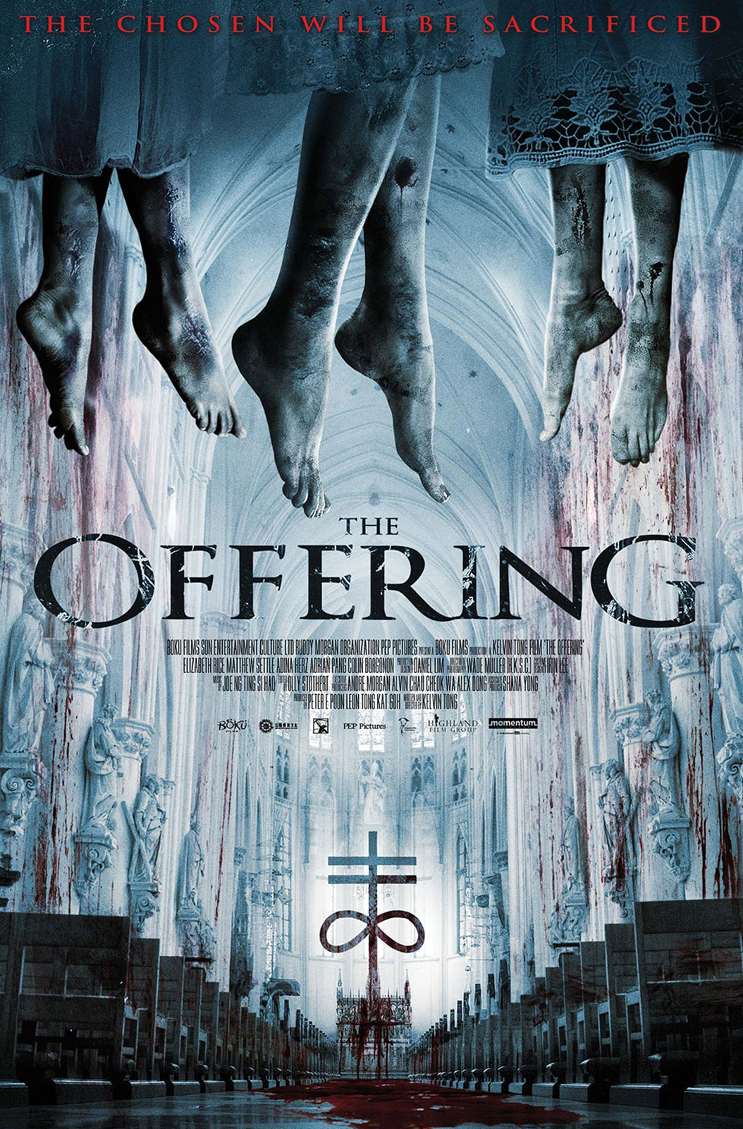
The Offering poster serves up an ominous slices of horror with its gruesome image. With its cold colour tones, offset with the bright red blood, the poster puts its title in a central position. However, Your eyes are drawn to the hanging feet at the top rather than the title. It is a little too busy at the bottom and but the poster has a strong gruesome tone which I found to be intriguing.
11: Sharknado 4: The 4th Awakens
The Sharknado 4 poster was first released on May the 4th, Star Wars days. So to celebrate the day, the SyFy Channel launched this Star Wars inspired poster. Channeling American artist Drew Struzan, the poster makes use of every inch of space. Using the contrasting colours blue and red, the poster is bold and beautiful.
10: Cabin Fever
Created by designers Art Machine, the Poster for the remake of Cabin Fever uses very careful composition and colour to blend together an eerie scene. The use of space gives the Cabin an isolated feel whilst the bloody eyes gives us insight into the films themes. It's a secluded and striking image.
9: Friend Request
At first glance, this image would appear to be a screenshot from the film, but a second glance reveals ominous shadow hands creeping in at the sides of the poster. Apart from the the films titles, the poster is void of colour and uses shade and lighting to draw your sight to the center of the poster.
8: Bedeviled
Using blue and red, the Bedeviled poster uses its colour pallette very cleverly. Your eyes are drawn to all three key points on the poster, its title, logo and the big bow tie. The graphical glitches implicate streaming video, whilst the cracks hint towards broken glass, maybe from a screen. Even the logo looks like the universal "on" symbol. The Posters use of visual clues give you a clear indication of the films computer based story.
7: The Conjuring 2
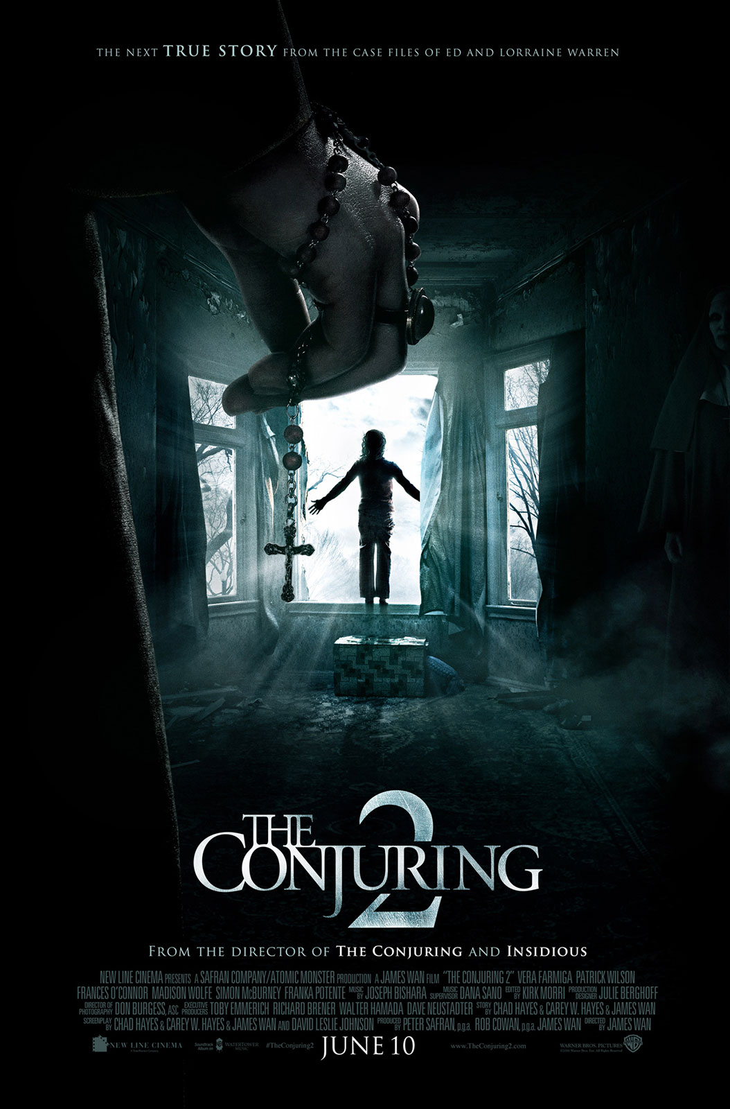
There's a lot going on in this Conjuring 2 poster, but it uses careful composition to prevent over saturation. The Films central focal point is brightly illustrated, whilst its spooky boarders sit in shadow.
6: Don't Breathe
The poster for Don't Breath uses all the popular posters trends, including desaturated tones and grunge textures. It's the clever use of lighting that draws your eyes to the house, despite the ominous closed eyes looming above.
5: Nina Forever
This risqué poster for the British horror comedy Nina Forever paints a dark picture. Going for shock value rather than creativity. This poster shows us Fiona O'Shaughnessy in a compromising position, a pair of severed hands clasped to her breast. It's gory, sensual and disturbing.
4: Incarnate
A refreshingly different poster emerges for the thriller Incarnate. A grasped hand clutches a crucifix, dangling into a wide screaming mouth. The picture is gently backlit with a warm and contradicting cool glow. This reflects the good vs evil story played out within the film. The subtle use of empty space contrasted by the colour makes for a striking visual.
3: Green Room
The Green Room poster cleverly reflect someone playing an instrument. Bent over, as if head-banging to the music, the character instrument is replaced with a machete, reflecting the films violent nature. The entire illustration is toned an eerie green with highlights drawing you to the center of the image. It's the use of shadow really helps to balance the visuals.
2: Beyond the Gate
Created by Sadist Art Designs, this cool retro styled poster reflects the films era. Using an unusual blend of light and dark purples the poster is a mysterious and smokey illustration. With the films stars positioned at the center of the poster, they are framed by both an old fashioned tv and a video cassette. The films title is aligned to become the VHS label. The entire composition screams of 1980's film.
1: The Neon Demon
The film Neon Demon has little substance to its bloated storyline, but it's poster certainly does a great job of capturing its use of colour and image. With striking colours and lots of sparkles, the poster uses very clever composition to frame actress Elle Fanning and the films title. Framed by a bright blue neon tube, the glow reflects on all the characters in the poster. The contrasting blue and red makes for a surreal fantasy looking image that could easily be from a sci-fi space adventure.
Hereditary (2018) Cast — Where Are They Now?
The supernatural psychological horror film still haunts us, but where are the cast now?
The Shine: Discover How it Connects Stephen King’s Astonishing Universe
Explore Stephen KIng’s Extended Universe Power
Comfort Comes with a Body Count
Real terror comes with a name TAG. Dr. Todd Brown brings small time suburbia into the horror highlight!
Krampus the Christmas Devil
Ho Ho NO!
Stir of Echos
Does it hurt to be dead?
Apt Pupil
A History of Horror
Movie Poster Movement – The Thing
Nobody trusts anybody anymore!
6 Film Posters that have Never Seen their own Film!
Not Quite Right!
Movie Poster Movement – The Shining
Here’s Johhny
Movie Poster Cliches – Skulls
Cracking!


