The Ultimate Guide To 80’s VHS Box Art That Scared You

I have memories of going to our local video store and being so excited about what we were going to watch that night, only to be confronted with some sort of terrifying creature reaching out from one of the boxes. Yes… I had wandered into… the HORROR SECTION. Many a sleepless night can be chalked up to the dark imagery artists conjured up for VHS covers, and this article celebrates some of the more menacing examples.
Let’s take a look at some of the most iconic 80s VHS Box Art that scared the pants off us during the VHS boom and the different styles used. Here is The Ultimate Guide To 80’s VHS Box Art That Scared You!
Showing off the BIG SCENE - An American Werewolf in London (1981)

John Landis’ classic werewolf romp is still one of the most loved sub-genre film of its time. The amazing set piece that sees American tourist David Kessler (David Naughton), transforming into a bloody thirsty beats is as powerful today as it was back when it hit screens in 1981. However, the film fell fowl to one of the VHS markets biggest sins, which was to show off its biggest and scariest scenes on its front cover. Think of Jack Nicholson splashed on the front cover of The Shining (1980), Heather O'Rourke channeling TV spirits from Poltergeist (1982) or the terrifying zombie from Zombie Holocaust (1980) menacing the front cover. With An American Werewolf in London, the film-makers decided to take one of the movies key moments and turn it into the promotional still for the film. The sight of a partially transformed Kessler screaming out in agony, on the box art, was enough to loosen the bowls of any one who wandered into the wrong section. And for those video clerks that plopped it on the front shelf nearest the door, shame on you!

Showing off the BIG SCENE Illustrated - The Video Dead (1987)

Like An American Werewolf in London, the production company behind 1987’s The Video Dead wanted to capture the films big moment, where a zombie arises from a smashed TV. I’d like to believe that director/writer Robert Scott had big plans for this moment in the film, but when it came down to capturing it, nothing was up to par. The practically effects were basic, the makeup was ropey and the cinematography just never caught the grandiose moment that it deserved. So they fixed it in the poster, by illustrating it in a highly charged picture that is visually grabbing and shocking. Other films that also illustrated it’s best scenes was Street Trash (1987), Scanners (1981) and Deadly Blessings (1981) , but none are as terrifying as the TV shattering zombie from The Video Dead.

The Creature on Show – Critters (1986)

You can’t blame film makers from wanting to show off their horrible creations, but it did not have to be so in your face. When film makers couldn’t hold back and JUST had to show off the entire creature, it took away a little of the films mystery, whilst scaring the pants off those browsing the shelves. Similar films such as Gremlins hid their monster from viewers, but Critters (1986) just couldn’t resist putting one of those damn ugly little buggers on their front cover. To make matters worse, they even supplied stores with massive standees of the Crite, so everyone saw it as you walked in. Whether you liked horror or not, you’d see this monstrosity. Other films that took this approach were Ghoulies (1984), Xtro (1982) and C.H.U.D. (1984)

Inanimate Horrors – Death Ship (1980)

If you’ve watched half a dozen random 80’s horrors, no doubt half of them would be real stinkers. That’s why it was up to the box art to pull suckers in to watching them. Once they were caught, they had no choice but to watch the damn film because they had just spent money on renting it. So many a deviant filmmaker would conjure up some sort of nightmare fuel to inspire those big rental numbers, even if it did not really depict what was happening in the film. Turning inanimate object into horrifying manifestations was a popular method. Death Ship used this to great effect by transforming a ships hull into a horrifying skull-like face. Mix in some ominous fog, dark deep water and a bunch of people in a dingy about to be chomped on by the looming vessels, and you get yourself a deeply disturbing piece of art! Yep, this never happened in the film…but it looks cool on the box! Other examples are the box art for Halloween 2 (1981), Amityville II: The Possession (1982) & Trick or Treats (1982).

Something Disturbing – Demons (1985)

Some of the later artwork for Demons is perfect. It showcases the classic silhouetted scene of the demons coming up the stairs. It’s a piece of artwork that sells you a scene, whilst giving you no context. However, it’s earlier rental boxes came from its need to over sell, by chucking on the films most disturbing image it could find. The Kathy demon is one of the film’s most left-field scenes and for many viewers, it’s the most shocking. By plastering the bloody creature on the front cover, it kind of mis-sold what viewers would get. Whilst the goods were great, there was no need to chuck such a terrifying image at potential renters. Other disturbing creatures that graced the front covers of VHS’ are The Company of Wolves (1984), Food of the Gods II (1989) & Underworld (1985)

Terrifying Floaty Head - Fright Night (1985) / Slaughterhouse Rock (1987)

We’ve written about the Movie Poster Cliches – Face Above a House, and because this fad is so wide spread, I thought I’d show off two unsettling images for this entry. One of the popular Movie Poster Cliches of the 1980’s was to grab a building and then slap a big old face above it, looking down upon the viewer with gleeful disdain. Slaughterhouse Rock did this to great effect, with the possessed fanged face of Richard Gardner (Tom Reilly) glaring down at you from the corner of his eye. The cover that disturbed me most as a kid, was none other than Fright Night, which showed off Amy Peterson’s (Amanda Bearse) final vampire form. In a weird bit of film serendipity, this make up effect for Amy was rushed together within a few days of shooting and was only supposed to be seen for a second. However, director Tom Holland loved it so much, he shot with the make up for an entire day. Amy’s toothed face ended up on the poster and VHS cover. As a kid I was always relieved to find that the films sequel used a different illustration of Amy’s ugly mush, one that was far less scary, so much so that I’d prefer to watch that film then face looking at that fanged monstrosity on the original films cover.

Posed Pictures – Jason Goes to Hell: The Final Friday (1993)

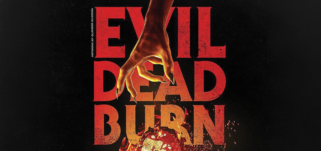
When some company’s had a bit of money to burn, they would often take professional stills for a film’s promotion. Probably one of the greatest examples of this was for the Evil Dead. Bruce Campbell and voice actress Bridget Hoffman posed for promotional images that would eventually inspire the classic Evil Dead poster. Whilst it wasn’t as Widley used as other mediums, such as illustrations, when it was done well, it made a huge impact, such as the covers for Hellraiser (1987), The Fog (1980) & , The Serpent and the Rainbow (1989).

Non Film Related – The Thing (1982)

Not Every poster had to make sense, in fact, a number of VHS covers were plastered with scenes and imagery that had very little to do with the film within. The best example of this is John Carpenter’s The Thing (1982), which featured a fuzzy haired fellow floating in an icy prism, with his face replaced with an ominous alien glow. Very little to do with the film, but impactful nerveless. Other examples is Blood Beach (1981) and it's bikini victim, Dead & Buried (1981) with it's head in the ground and Creepshow’s (1982) theatre skeleton.

Illustrated Horrors - The Kindred (1987)

Give an artist a pen, and they’ll draw you a picture. Give them a brush, they’ll create a painting. Tell them to paint some demonic looking snake limbed doom creature and they’ll whip up the neon green glowing monstrosity that is The Kindred VHS cover. Love it or hate it, this thing gave me nightmares. Having recently re-watched this, thanks to a bloody amazing blu-ray transfer from Synapse Films, it’s clear that the foreboding atmosphere created by this illustration is nothing more than nightmare fuel conjured up by the artist. Whilst the Anthony creature on the box looks a little like his film counterpart, the poster depicts something that is far more terrifying. The same could be said from the illustrations from The Fly (1986), 976 - Evil (1988) & Maniac (1980).


"Hello Horror Fans - These covers make me SHIVER! I do love a good collection of VHS cases, and these are great selection of artwork to CHILL. Did we miss something? Let us know your favorite VHS designs in the comments below.
Keep Rotten"


